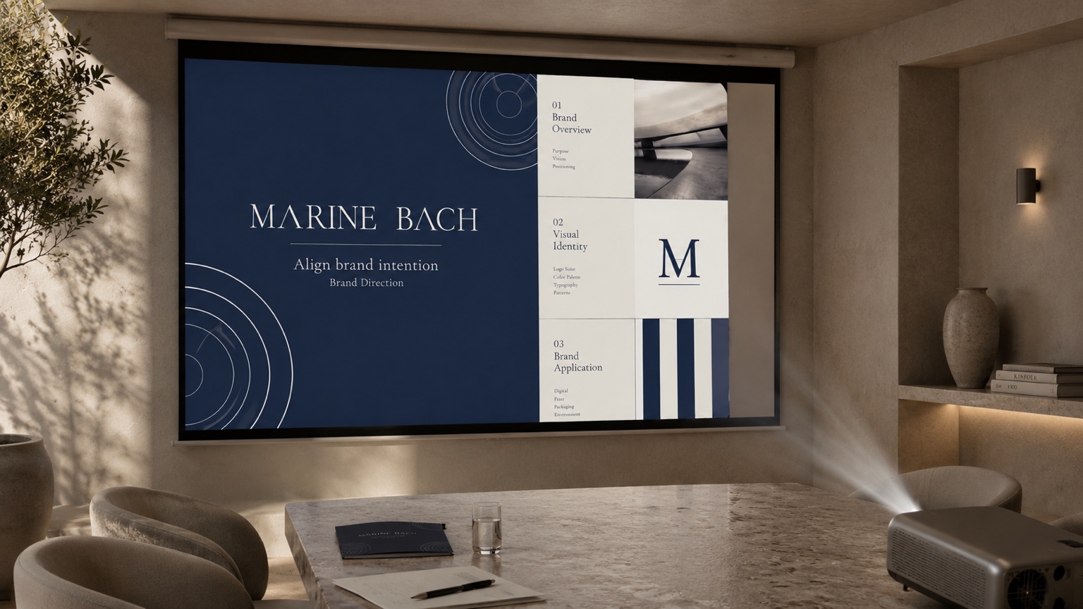
Brand Direction Β· Visual Identity

Coherence

Logo, colour, typography, imagery, motion, and application standards shaped into one visual language.

The visual system is shaped into one language across identity, layout, and motion. Each application holds the same visual standard.

Usage & Applications
Where the system becomes usable without losing its standard.
Prepared Outputs
Files, standards, and handover notes prepared according to scope.
ALogo Forms, Suite & Pattern
Why the name leads, the suite it sets, and the waterline pattern.
BColour & Tone
A restrained palette for editorial clarity.
CTypography
Type roles, specimens, and standards in use.

Direction Β· in motion

The name resolves, the line holds

Movement reads as intention becoming visible β€” restrained, never decorative.

Usage & Applications
Where visual identity becomes usable assets.

A visual identity is not only a logo. It needs clear standards for the places where the brand is seen, handled, shared, and presented.

Digital mockup with Marine Bach website and mobile view
Digital and online use
  • Website & landing page direction
  • Social media identity & post templates
  • Email signature & digital letterhead
  • Online brand and introduction headers
Print mockup with Marine Bach stationery and business cards
Print and brand materials
  • Business cards
  • Letterhead & envelopes
  • Printed brand introduction sheet
  • Flyers & printed invitations
Product and packaging mockup with Marine Bach applications
Product and packaging applications
  • Packaging & box direction
  • Product label layout
  • Hang tags & stickers
  • Shop or display signage
Presentation room projector mockup with Marine Bach deck
Proposals, pitch decks, and presentation materials
  • Brand & pitch deck templates
  • Proposal cover & layout
  • One-page brand sheet
  • Speaker slides & name cards

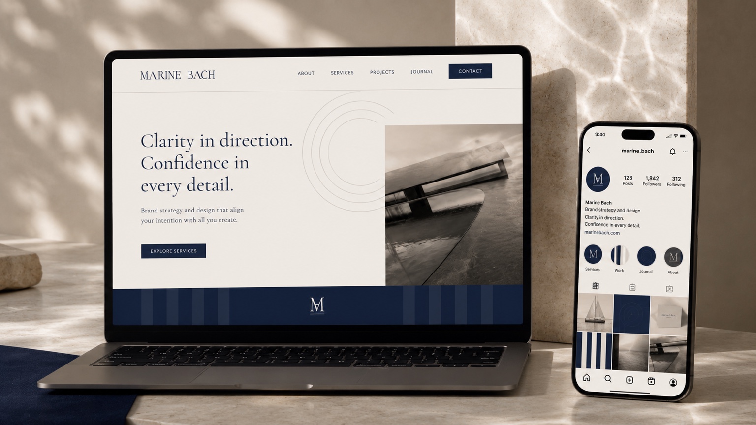
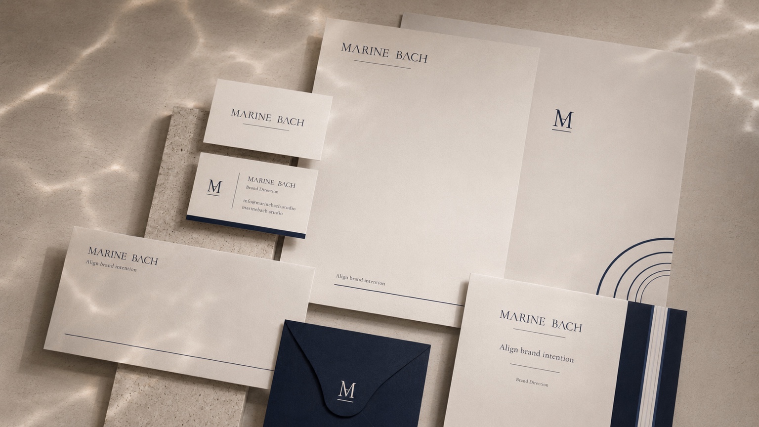
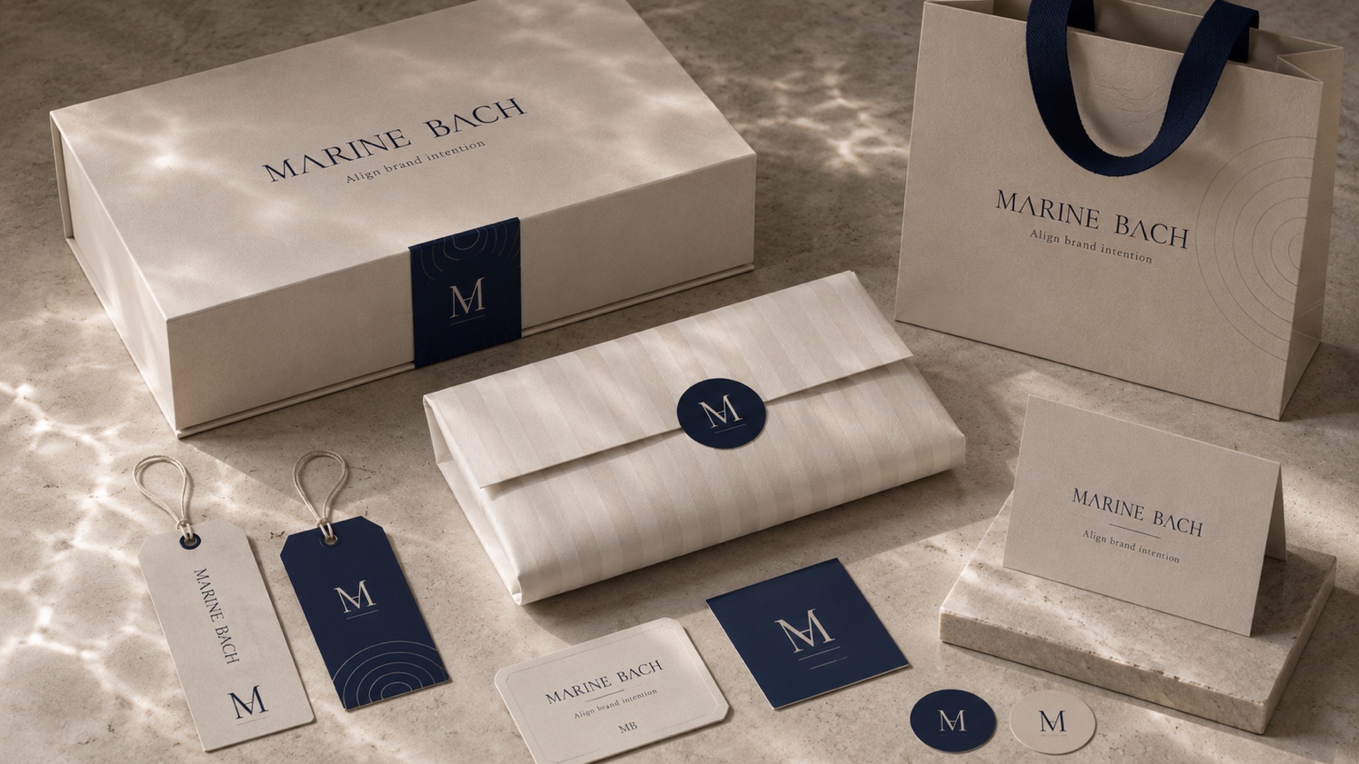
The exact applications depend on the brand. The point is not to produce every format by default, but to decide where the visual system needs to remain consistent and prepare the right assets accordingly.

01A Β· Wordmark, line, rule
The wordmark leads. The axis line sets the visual standard.
Marine Bach wordmark
Pearl white reference
Light water reference
Horizon ripple reference
Slate ripple reference
Axis navy reference
Ink navy reference
Paper
#F3F1EB
Panel
#ECE9E1
Greige Line
#C9C3B7
Slate Soft
#5A6678
Axis Navy
#222E48
Ink Navy
#19223A
The wordmark leads.

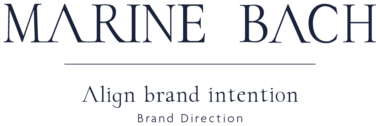
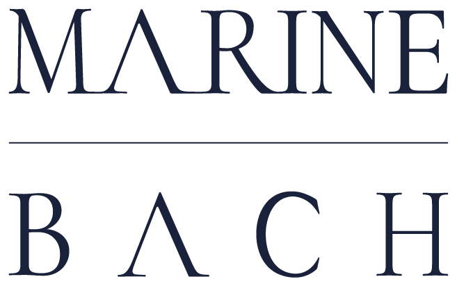
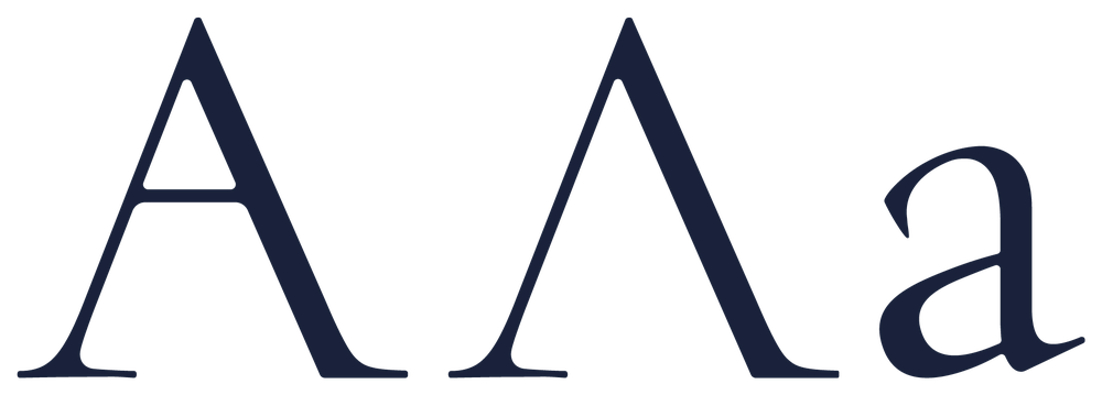
Marine holds the stillness of the sea. Bach carries the movement of a stream. The crossing is expressed as a line. The value is completed inside the name and its standard.

Image language Β· horizon

The waterline as visual structure

Primary horizontal wordmark
Primary
Full lockup
Full
Stacked wordmark
Secondary
Soft wordmark
Editorial
Submark / favicon
Submark / favicon
Symbol combination reference
Reference

The image system follows the same restraint as the identity. Horizon, surface, reflection, line, and controlled negative space form the visual language. Water functions as structure, not scenery.

03A Β· Logo forms considered
A logo can take several forms. Each was tested against one question: what does this identity need to be, and what would it accidentally become?
ChosenMarine Bach primary wordmark
Wordmark
SupportMarine Bach lettermark β€” geometric and monogram support marks
Lettermark
DeclinedDeclined pictorial logo exploration
Pictorial Mark
SupportAbstract geometric development process
Abstract Mark
ReferenceMarine Bach emblem exploration
Emblem
DeclinedDeclined character logo exploration
Character Mark
The wordmark is chosen.

No symbol is added, because the value sits in the name and the standard behind it. The axis line is the only fixed element that travels with the name.

04Logo in motion & pattern

Clear motion, only where it is needed.

Marine Bach. Align brand intention.
Waterline pattern one
Waterline pattern two
Waterline pattern three
C Β· Typography
Each typeface has one role.
Spectral Β· Eyebrow
Brand Direction Β· Visual Identity
Marine Bach Display Β· Headline
Align brand intention Marine Bach Display sample
Cormorant Garamond Β· Subhead
Logo, colour, typography, pattern, motion, and application standards.
Spectral Β· Body

The display face holds the headline, the serif balances the system, and the body face supports long-form readability. Each role is separated to keep the system clear.

Cormorant Garamond Β· Button
Start an enquiry
Spectral Β· Caption
Figure 01 β€” type hierarchy in use
The three faces in one working structure.
Marine Bach Display Aa specimen
Marine Bach Display Customisation available
Display Β· headlines & covers
Marine Bach Display headline specimenMarine Bach Display alphabet specimen

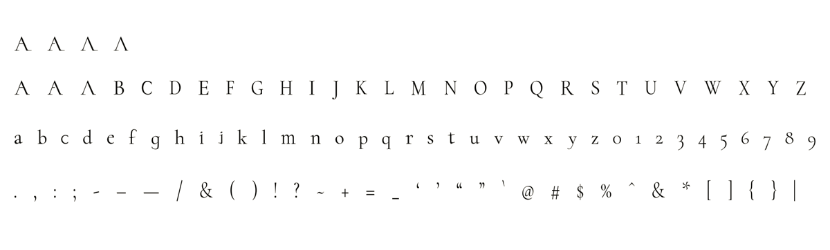
A customised typography system can be developed from the wordmark’s own logic, for headlines, covers, wordmark-adjacent moments, and selected brand assets. Depending on scope, this may remain as lettering direction or extend into complete font file development as an additional phase.

Aa
Cormorant Garamond
Display support Β· titles & pull-quotes
Align brand intention
A B C D E F G H I J K L M N O P Q R S T U V W X Y Za b c d e f g h i j k l m n o p q r s t u v w x y z 0 1 2 3 4 5 6 7 8 9. , : ; - – β€” / & ( ) ! ? ~ + = _ β€˜ ’ β€œ ” @ # $ % * [ ] { } |

The working display companion. It carries titles and quotes where the custom face is not yet set, and keeps the visual language literary without becoming decorative.

Aa
Spectral
Body Β· running text & captions
Align brand intention
A B C D E F G H I J K L M N O P Q R S T U V W X Y Za b c d e f g h i j k l m n o p q r s t u v w x y z 0 1 2 3 4 5 6 7 8 9. , : ; - – β€” / & ( ) ! ? ~ + = _ β€˜ ’ β€œ ” @ # $ % * [ ] { } |

The body face keeps the page readable, quiet, and unhurried β€” supporting the message without competing with it. Used for running text, notes, descriptions, and captions.

C2Standards in use
Small changes in typography, spacing, colour, contrast, and logo use can change how a brand is read. These examples show why visual guidelines are part of the identity system, not an afterthought.
Γ—
Visual
identity
system
βœ“
Visual identity
system
Typography changes tone.
The same words can feel scattered or deliberate depending on how type roles are set.
Γ—
Clarity is not
reduction.
βœ“
Clarity is not
reduction.
Spacing changes precision.
Kerning and line-height change whether the identity feels considered, crowded, or unstable.
Γ—
Visual identity
system
βœ“
Visual identity
system
Contrast changes usability.
A restrained palette still needs enough contrast for text, labels, and digital use to stay clear.

In client work, this becomes a practical guideline section: type roles, spacing rules, contrast checks, logo use, source references, and handover notes.

Prepared Outputs
Files, standards, and handover notes prepared according to scope.
Brand Board

A system board that brings logo, colour, typography, pattern, and visual standards into one view.

Brand Guide Document

A reference document covering brand direction, logo use, visual standards, application rules, and delivery notes.

Logo Set

Primary logo, secondary logo, submark, and favicon prepared in the required vector and image formats.

Brand Concept Film (5–10s)

A moving identity piece for use across website, social, opening, and related brand moments.

Typography and Colour System

Type direction, palette values, contrast standards, hierarchy, and basic usage rules.

Pattern Set

Graphic elements for light backgrounds, dark backgrounds, spacing-led use, and applied use.

Custom Display Lettering

Custom typographic direction for wordmark, headline, cover, and selected brand material. When needed, this may begin as lettering direction and extend into a separate font file development stage.

Usage Standards and Source Record

An application guide including file organisation, usage scope, source records, and licensing notes.

A single wordmark and its core files, or the full system above β€” the files are prepared for use, with the reasoning behind each choice written down.